Roaming proposition transformation:
Rebuilding customer confidence
overview
EE made a significant commercial change, shifting from its long-standing pre-travel purchase model to "Buy When You Land".
Over the last 2 years, I led the evolution of the roaming experience for millions of customers, transforming a static information journey into a guided decision-making experience while balancing customer needs, commercial objectives and technical constraints.
PROJECT
Snapshot
Company: BT Group / EE
timeline: Nov 2024 - August 2026
role: Product Designer
SCOPE:
Product Strategy
Research Synthesis
UX/UI
Prototyping
Stakeholder Alignment
Delivery
collaborators: Product, Engineering, Content Design, User Research, Service Design, Business Analysis, Commercial, Customer Support, Delivery, Finance and Legal
IMPACT
& Metrics
Our customer, commercial & operational impact delivered across the project, along with its industry recognition
£1.5m+
Revenue within the first 3 weeks of the 2026 launch.
💸
89.9%
App conversion
📲
£369k
Annual benefit
📊
🎉
Won Outstanding User Research
Optimal Experience
Awards 2026
Nominated for
Best Customer Experience Redesign
ECCCSA 2026
🏆
35%
Incremental revenue increase
➜
⚙️
17 FTE
Measured operational
reduction
1.55 to 4.41
185% DCSAT increase
(Digital
Customer
Satisfaction)
📈
THE
Challenge
Our customers have spent years understanding Roaming as an Add-On they could set up before travelling. In 2024 the business introduced a new model: “Buy When You Land”.
This meant onboarding customers to an entirely new behaviour whilst removing what they already understood. Customers could no longer set up Roaming until they reached their destination.
The original journey:

01: DISCOVER
Customers find Roaming within Add-Ons

02: UNDERSTAND
Customers explore options & calculate costs

03: CONFIRM
Their Roaming is set up & ready for travel
I inherited Roaming in 2024 and led the first proposition as an MVP through ambiguous requirements, evolving business rules and significant technical constraints.
When the new experience launched in December 2024, the scale of the customer response became impossible to ignore. It exposed a critical gap: the digital journey wasn’t doing enough to help customers understand, or trust, the new model.
Customers were left to make sense of…
New roaming zones without context
Hidden account & device restrictions
Static, information-led experience
Unfamiliar passes with
limited explanation
Unexpected bills from misunderstood options (especially without a Spend Cap)
Fixed durations disconnected from travel plans

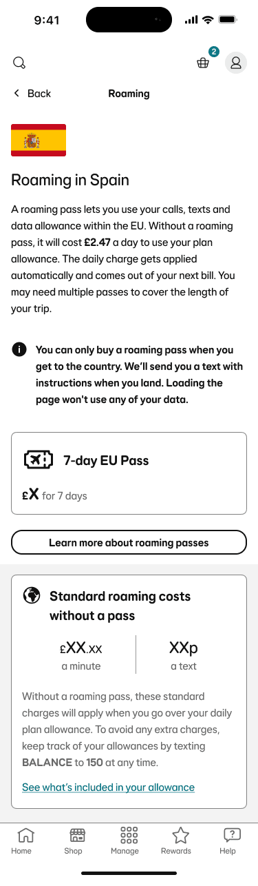
MVP
December 2024
This first release was followed by a 66% increase in customer support calls (34,000+ calls), a sharp drop in DSCAT and widespread user frustration.
TAKING
Ownership
The numbers told us something was wrong. I wanted to understand why.
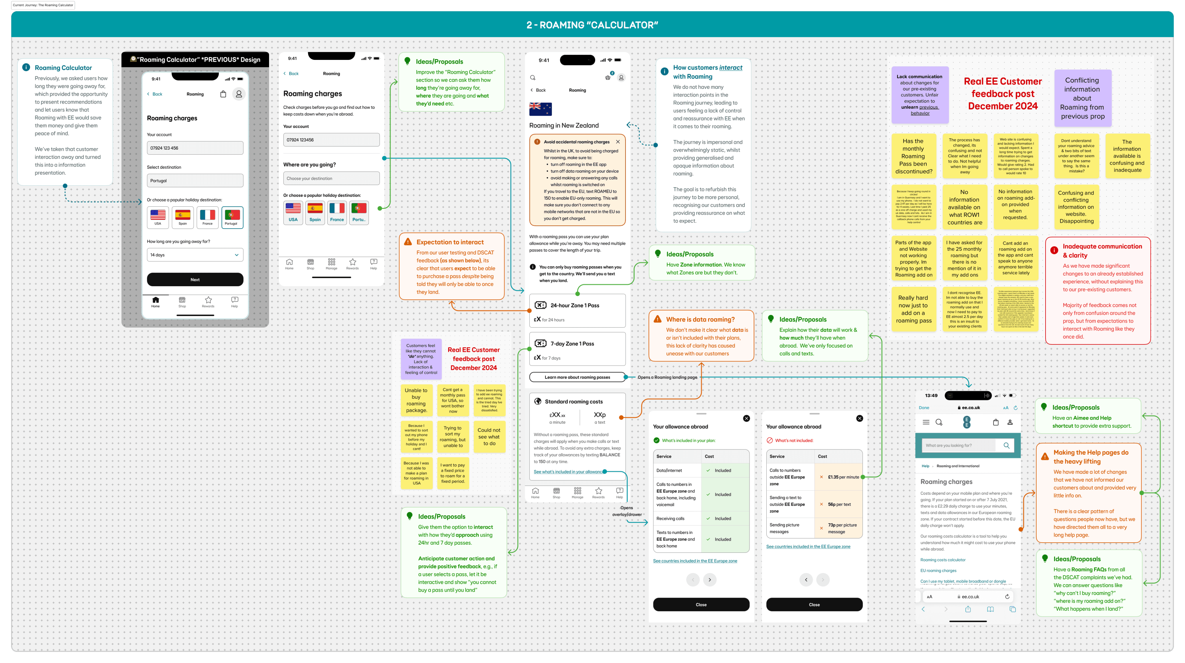
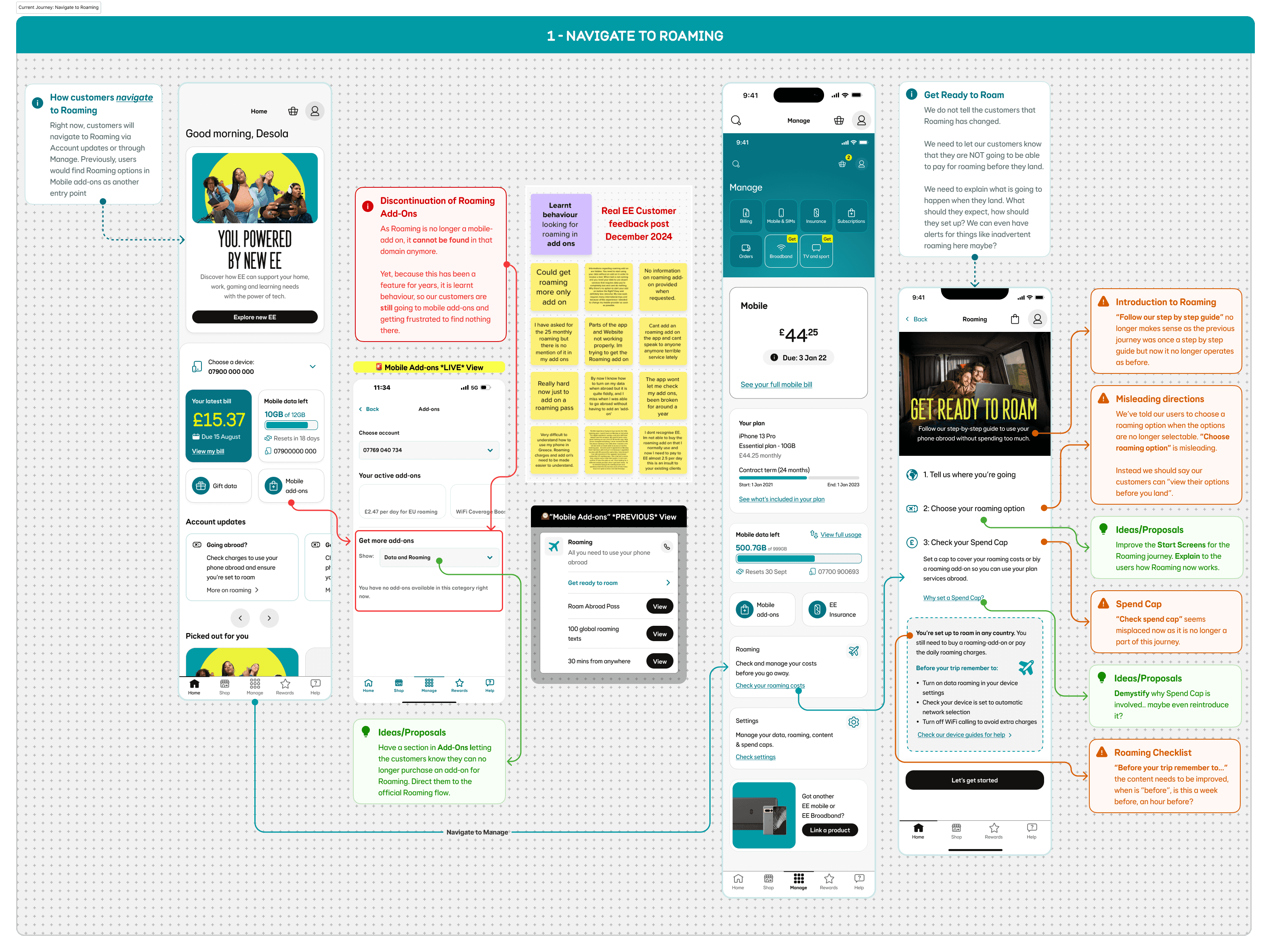
I proactively audited the end-to-end roaming experience to understand what was driving the customer response. I reviewed CSAT verbatim, categorised feedback into recurring themes, and cross-examined those findings against the live journey to identify where the experience was breaking down.
🗣️
01: Customer Feedback
CSAT data, verbatim & customer support
🧩
02: Thematic Analysis
Grouped & analysed recurring issues & feedback
🔍
03: Live Journey Audit
Mapped the feedback to the live journey
💡
04: Opportunities
Identified the key problems and their potential solutions
user testing
& Research
The audit gave us an early hypothesis and to validate it, we ran moderated & unmoderated research with UserTesting.com.
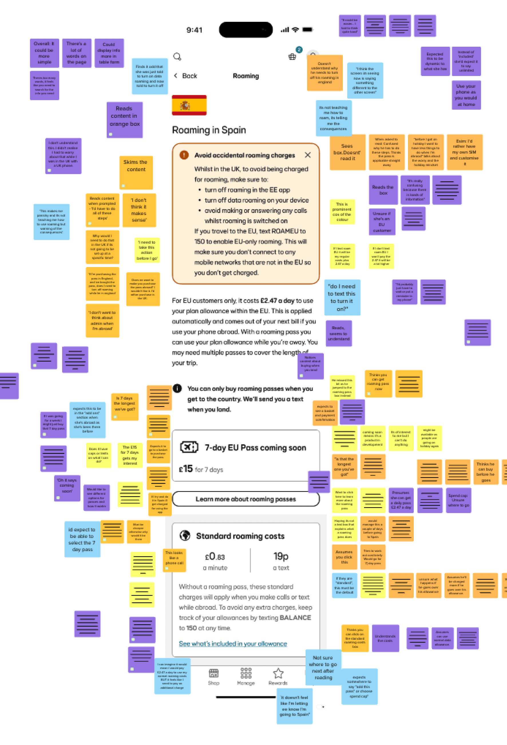
Research Sample
key observations
👁️
Repeated taps on non-interactive elements
Many users tried to tap on the passes and sections of text, expecting more detail or interactivity.
“
“Why won’t it let me add the roaming pass?”
— UserTesting participant
❓
Uncertainty about how and what to buy
Customers were unclear which pass they needed, what was included and whether it covered their full trip.
“
“I’m confused, does this cover my whole trip? Is that the longest one you’ve got?”
— UserTesting participant
🏃🏾
Using external tools to decide
Several users left our screen to calculate their best roaming option their calculator app.
“
“I’m not sure if this works, so how much will it cost to cover my travel? Do I need to work it out?”
— UserTesting participant
reframing
the Problem
Across the audit, research and testing, one problem consistently surfaced: uncertainty.
Customers were navigating an unfamiliar roaming model, new terminology and limited guidance while being expected to figure out the right option themselves.
Our main takeaways were:
01: Familiarity had been broken
Customers expected roaming to behave like the previous Add-On journey, creating a mismatch between their mental model and the new experience.
02: We’d introduced cognitive load
Customers struggled to understand the new guidance and passes, repeatedly questioned their choices, and tapped non-interactive elements for more information.
So our next question was...
How might we help millions of customers make confident decisions when the commercial model they understood had fundamentally changed?
dESIGNING WITHIN TIGHT CONSTRAINTS
The ideal experience was simple: customers tell us where they’re going and for how long, receive the best roaming option and purchase it.
The existing backend could not support that.
Alongside an unfamiliar new proposition, I had to design around significant technical & constraints, without passing that complexity to customers
The new experience needed to account for:
🔒
01: Fixed durations
Passes were limited to 24hrs, 7 days or 12 days.
🛬
02: Purchase after landing
Passes couldn’t be bought or activated before travel
⏰
03: Only one pass at a time
Passes couldn’t be stacked, so customers had to wait for one to expire before purchasing another.
💬
04: Purchase outside of the app
Even abroad, passes had to be purchased through an SMS link rather than directly in the EE app
Resolving these constraints at platform level would require significant time and investment. Rather than waiting for the ideal backend, I designed an experience around what the existing platform could support, while accounting for its future evolution.
And lastly, it needed to:
✅
Work within existing APIs
✅
Remain accurate & legally compliant
✅
Meet Accessibility & Loop (our design system) standards.
✅
Work across app & web
✅
Support incremental delivery
✅
Create reusable patterns beyond Roaming
April 2025
Roaming Recommendation
I transformed the static experience into an account-aware planning journey that used their trip details to provide personalised cost recommendations.
DESIGN DECISIONS
➕
Trip customisation
➕
Roaming recommendations
➕
Interactive product exploration
➕
Anticipating purchase intent
➕
Bill shock mitigation

Impact
✔️ Improved customer understanding
✔️ Increased DCSAT from 2.39 to 2.89
✔️ Reduced support demand
wHAT WE LEARNT
Understanding improved.
Preference didn’t.
Behavioural analysis and feedback from the improved experience proved that despite customers having a clear understanding of how Roaming now works, they simply did not want to wait until arriving abroad to purchase.
This evidence gave the business confidence to greenlight pre-travel purchasing, an outcome Design had consistently advocated for...
AUGUST 2026
Roaming Refresh
Following the 2025 release, I shaped the end-to-end evolution of EE Roaming whilst introducing our new pre-booking proposition. Working across Content & Service Design, Delivery, Finance, Legal and Engineering, I translated customer behaviour, commercial priorities and platform constraints into our most significant release to date.

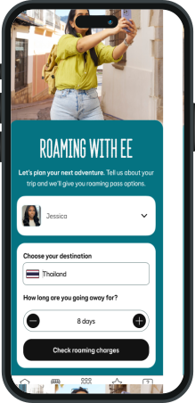
1
Landing page
A clearer place to start
A clearer hierarchy confirming who the journey is for and capturing their trip detail to establish a purposeful route into personalised Roaming options.

2
ROAMING RECOMMENDATION
Designing across two fulfilment models
The recommendation combines passes that cannot not be purchased at once.
My concerns were that customers could mistake partial pre-booking for complete trip coverage.

I structured the information hierarchy around purchase timing as tags above the pass names. Alongside with guidance explaining how the passes work together.
Interactive links open contextual drawers covering purchase, activation and inclusions keeping the recommendation compact & scannable while providing enough detail for confident planning.

OPTION FLEXIBILITY
Structuring choice
Sleeker card design made passes easier to compare and supports exploration beyond the recommendation.
I organised options by how customers could access them. This clarified the addition of pre-booked roaming alongside the existing buy-abroad proposition.

I also surfaced the Zone structure within our native app, having previously only been available through web FAQs. This was important because one pass can cover multiple destinations and not just the one selected.
Interactive links opened details within contextual drawers to preserve focus and remove the need to continue on the web.
3
4
eu daily charge
Understanding automation
Unlike passes that customers actively pre-book or purchase abroad, the EU Daily Charge applies automatically when they use their phone.
I positioned it away from the tabbed roaming options and also surfaced it directly within the recommendation place emphasis on its differing behaviour.

Clear guidance explained its activation, daily recurrence and relationship with existing EU passes, helping customers understand when and why they would be charged without mistaking it for another product they needed to purchase.
5
SPEND CAP MANAGEMENT
Crafting cost control
EU Daily Charge relies on the customer having sufficient Spend Cap available. If it is too low or set to £0, they may be unable to access their plan allowance abroad.
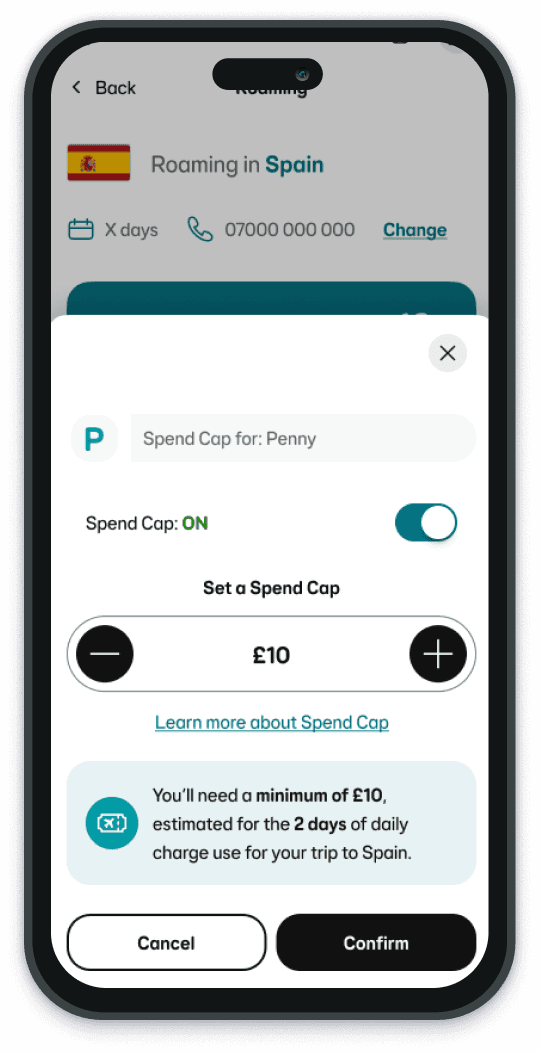
I recognised an opportunity to embed the Spend Cap widget I’d previously designed for EE, adapting it to support the Roaming journey and to connect to our wider ecosystem. See the Spend Cap case study.
Now, four context-aware states respond to the customer’s current limit (or lack of) and recommend a minimum based on trip duration. This is for bill shock mitigation and to avoid service disruption abroad.
6
ROAMING PORTAL
Introducing the post-booking state
Pre-booking created a new lifecycle state before pass activation.
I designed an account-aware portal, surfacing the booked pass, it’s activation window and behaviour.

Contextual drawers extend the progressive disclosure pattern used throughout the journey.
Additionally, a new cancellation action gives customers post-booking control without cluttering the summary.
This experience stretched me beyond interface design.
Roaming did not come with a neat brief or finished requirements. We knew the experience needed to change, but shaping that change required close collaboration across customer, commercial, operational and technical teams.
I visualised proposition options to support executive investment decisions and took ownership of the end-to-end design. As my understanding of Roaming grew, I became a trusted point of contact across teams and more confident helping shape the product, not just its screens.
This has been one of my most formative projects, and I’m excited to bring that experience to my next challenge.
Desola
senior product designer